Patagonia Traveler
Now their website stands out from the competition, has expectional usability, builds trust, serves content in multiple languages & currencies, and and brings in new leads consecutively.
Problem
Restricted, unscalable systems
Content slow and expensive to update due to developer dependency
Outdated technology and UX
Result
Scalable system with a headless CMS
Team can easily build new pages and update content by themselves fast
Modern and user-friendly UX
Client review
"Our main challenge was updating an outdated website to meet industry standards and support multiple languages. We now have a beautiful, multilingual site that is easy to maintain and delivers a great user experience. Johannes brought creative ideas to the table, and his commitment was absolute, keeping the project on track with clear tasks and deadlines."

Before, their homepage lacked a clear UVP, was limited to the given template structure and images were low quality.
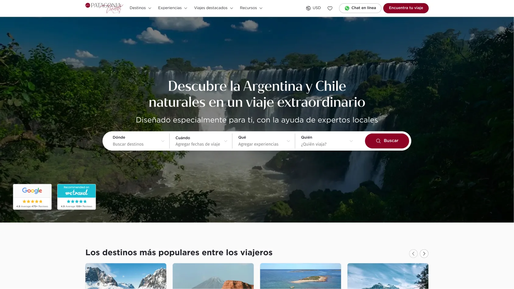
After, their homepage follows best practices, features a strong hero video, a clear value proposition and strong social proof and a trip search bar to immediately make visitors take the next step.
Below the hero section, visitors are invited to explore the most popular destinations and recommended trips. This gives them an idea of what their own journey could look like,
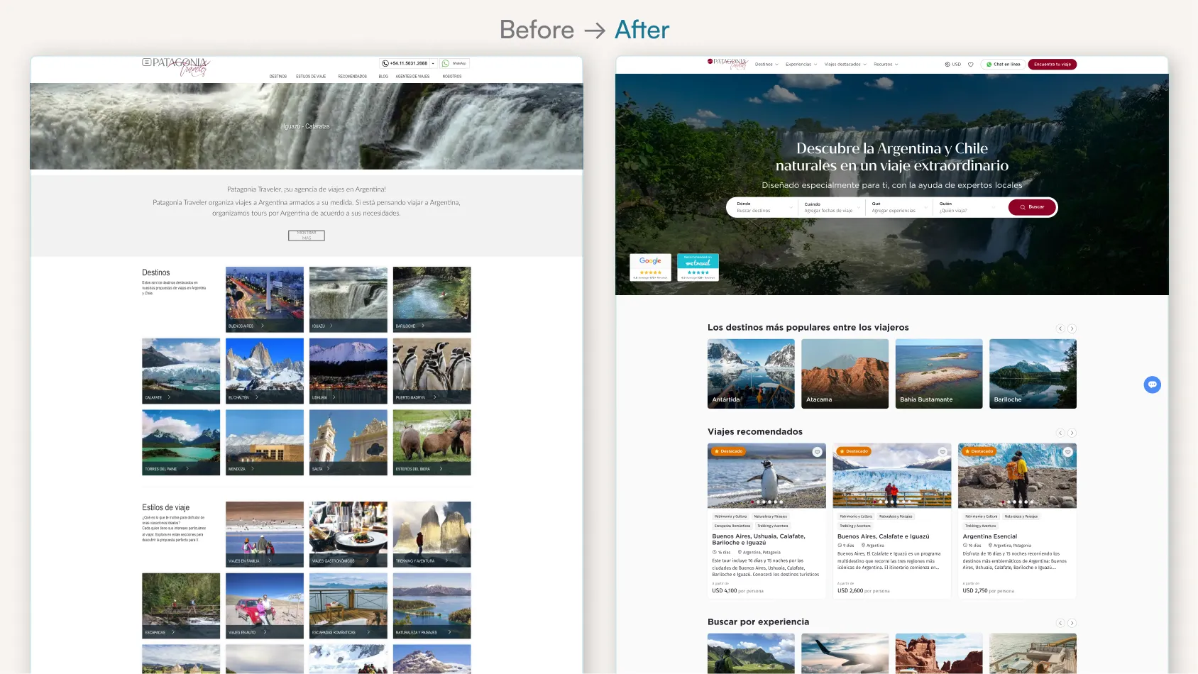
The new hero section utilizes emotional storytelling through a powerful video that shows vividly what travelers can expect when booking with Patagonia Traveler.
Review badges to build trust and a prominent search bar are strategically placed to increase conversions.
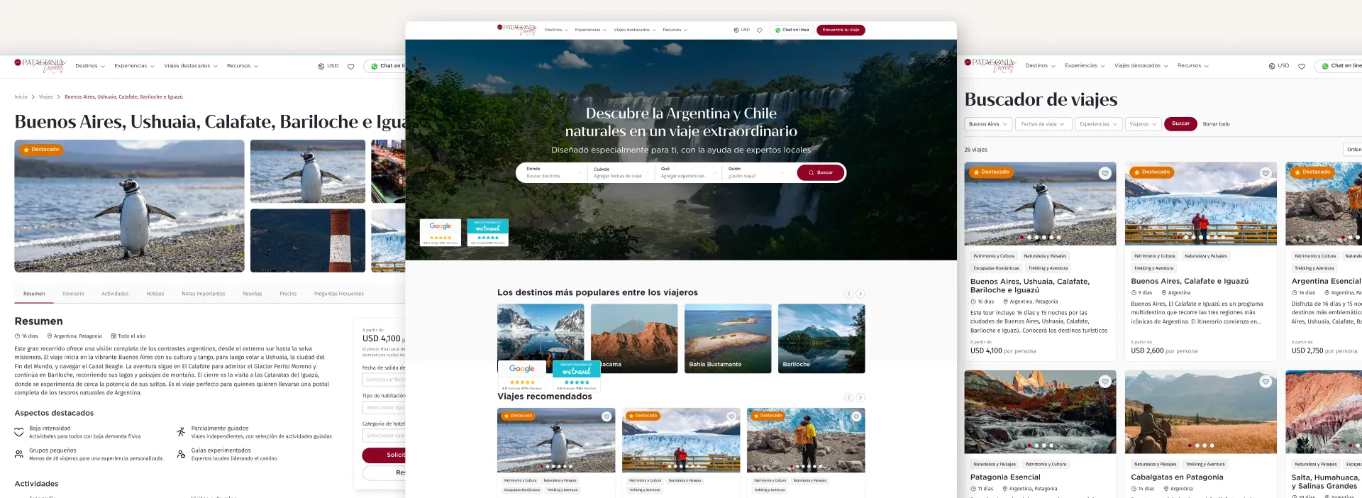
Before: The old trip detail page was based on a template and thus very limited in it's visual showcase capability.
1 image and 1 text block to describe the itinieray.
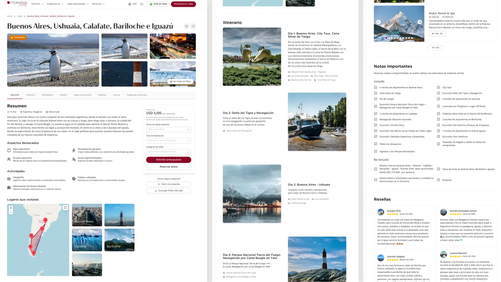
After: The new trip detail page is completely tailored to their needs, flexible and allows for a much richer and in-depth description of trips.
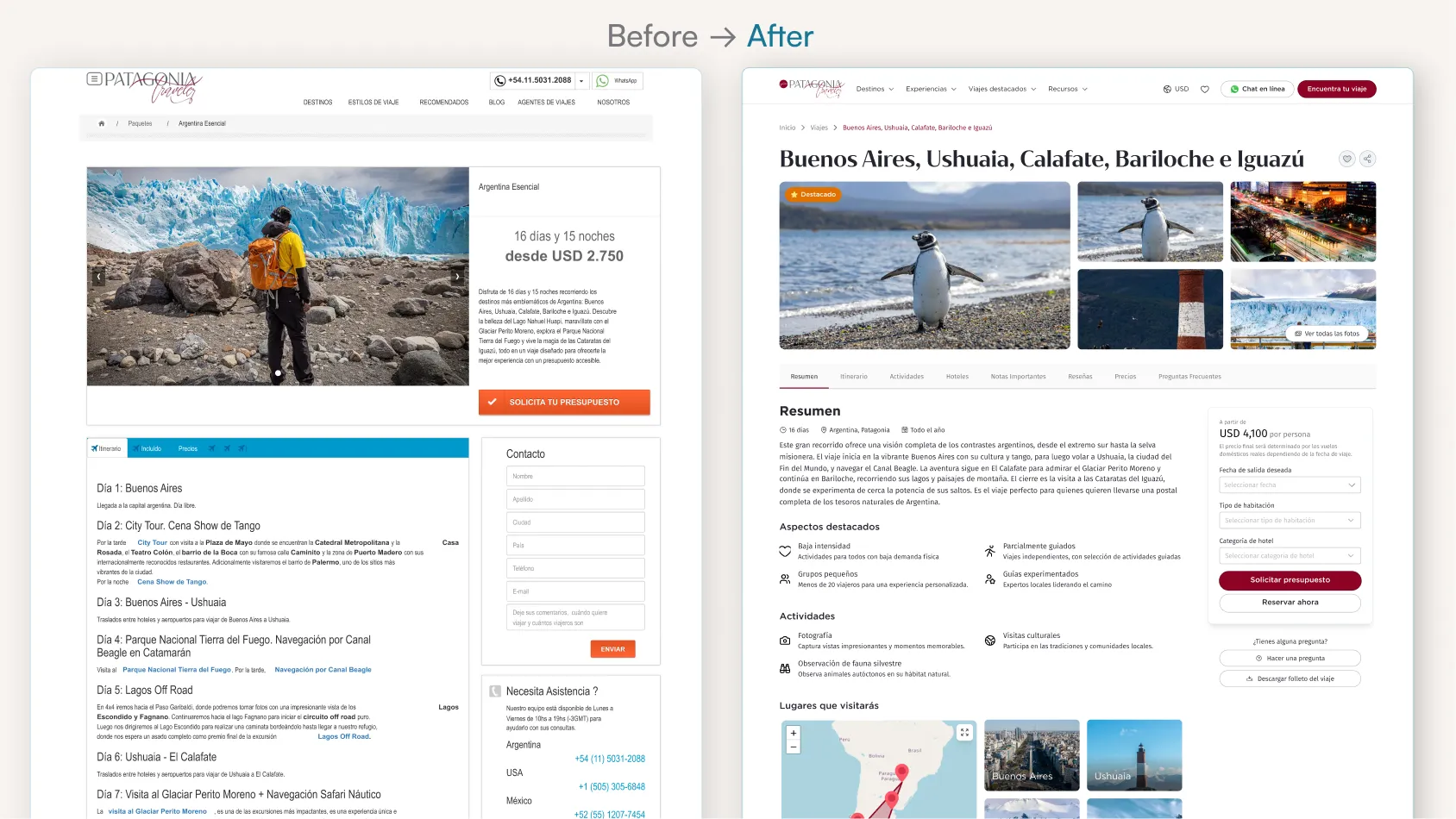
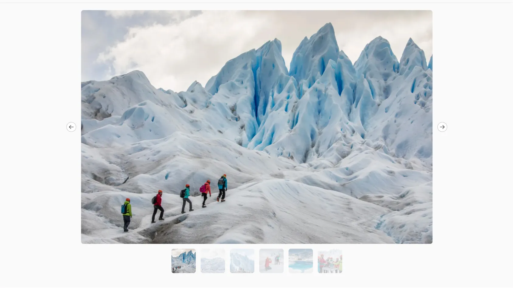
The new trip page features a prominent image gallery including video elements, a custom page structure with multiple different sections like summary, day-to-day itinierary, interactive map, activities overview, featured hotels, important notes, prices, reviews and FAQs.
Thee price in the sidebar CTA box is dynamically updated depending on the selected options and stays always in view.
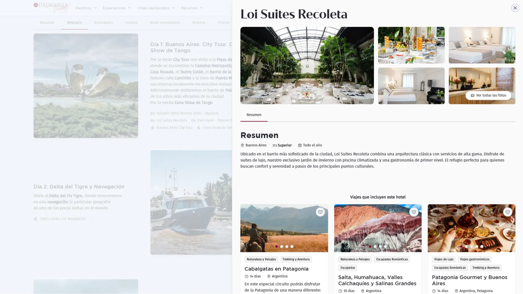
Side modals provide extra info about hotels and activities. This way, visitors are kept on the page and nudged to take the desired click on - "Request a quote".
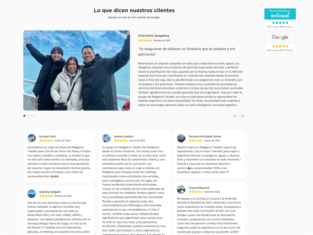
Social proof and review badges throughout the whole site to build trust and rapport with visitors.
High-quality images are delivered through the Storyblok CDN in just the right dimensions and size, making them load fast while not compromsing on quality.
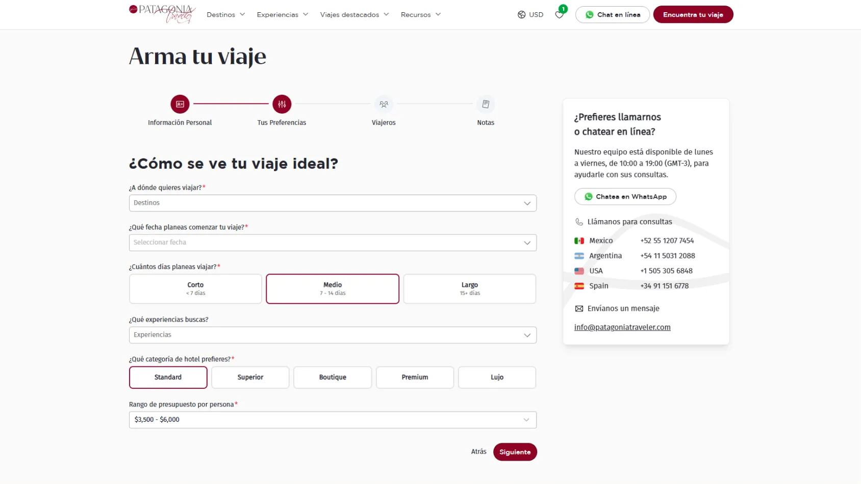
Improved UX through multi-step forms that guide user through longer forms and increase conversions.
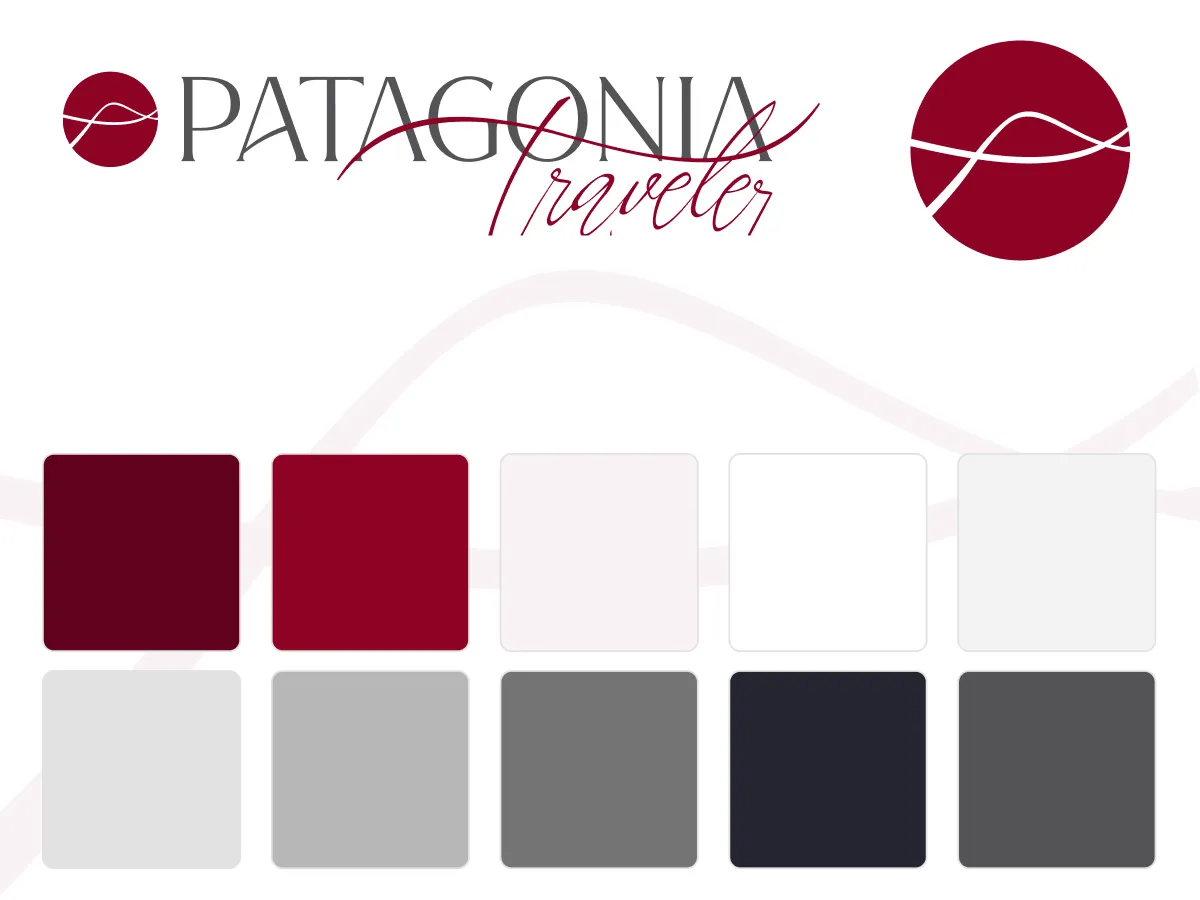
Slight brand refresh to modernize the existing branding and apply a simple, scalable design system.